
Data visualization helps you understand information

Images make the difference
Data visualization—this article will help you bring structure to your data. To do that, we start with images that inspire you. Think back to a unique photo that’s forever etched in your memory. Do you have the same vivid recall with plain text?
The answer to that question immediately highlights why data visualization is so powerful.
A picture is worth a thousand words… Now consider that we live in a world bombarded by a constant flow of information. Without the right tools, you’ll drown in an endless stream of data demanding your attention—day after day.
The Importance of Visual Content
When you visit a website or browse a product brochure, your attention instinctively goes to the images first. Do they match what you’re looking for—or what you find appealing? If the visuals don’t align with your interests, you’ll quickly move on to another website that does feel right.
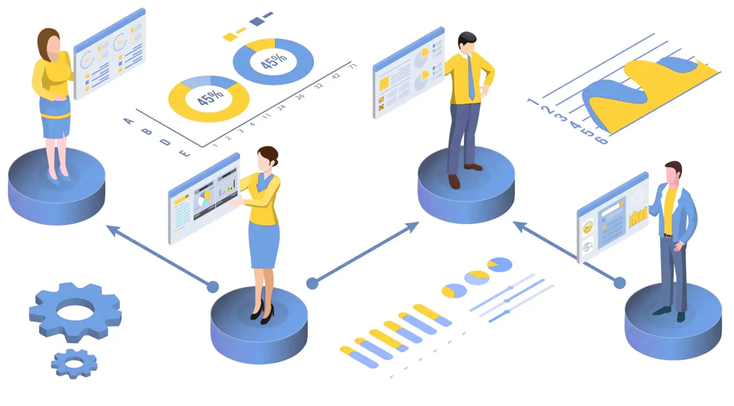
With data visualization in an organization, it’s a bit more complicated. The content presented is what it is—you can’t just “escape” to another website. We’ve noticed that some companies handling data visualization reduce it to basic dashboards filled with the usual pie and bar charts. Our specialists take a more creative approach.
Beyond just conveying the necessary data, we prioritize presentation. And we don’t do this alone—we see it as a collaborative process with our clients. Efficient, effective, and hassle-free—getting you exactly what you need.


Where Is This Heading?
Concretely, we work out-of-the-box with two different platforms available in the EasyData Cloud. For displaying data and the results of data analyses, our first choice is Grafana. However, when a data visualization project requires manual verification—such as document comparisons, extracted data validation, or similar tasks—our EasyVerify platform comes into play.
Both Grafana and EasyVerify are low-barrier platforms, meaning they’re easy to adopt. They can be used either in the EasyData Cloud or on-premise. The advantage of the EasyData Cloud? Quick onboarding—once we understand your requirements, you could be working on the first visual representation of your data as early as the next day!
Data Visualization Provides Greater Insight into Your Data
EasyData’s data specialists are well-versed in a variety of compelling data visualization solutions—including open-source tools like Grafana, as well as Microsoft Power BI and Excel reports. Our Data Experts deliver visualization solutions tailored to your organization’s existing workflow.
We start by immersing ourselves in your data structures: What data is available? Is an online solution preferred, or is an in-house approach more aligned with your needs? Discover the range of out-of-the-box solutions we offer, and let us surprise you with the possibilities.
Contact us today for a no-obligation data visualization overview!


Data Visualization in the Cloud
While other sections of our site discuss on-premise data visualization, this article focuses on cloud-based data visualization. Data insights vary for every process, making each visualization setup inherently unique.
Data visualization is never the same—this stems from factors like differing available datasets, which is precisely what makes data insights so valuable. Every process has its own performance requirements, and we can connect specific sensors or datasets upon request to monitor exactly as needed.
In our own cloud environment, we create instantly adjustable visualizations without impacting existing applications.
Creating a Visualization Dashboard
The days when a single application was used for data processing are long gone. Today, businesses rely on multiple applications—and older legacy systems often still play a crucial role in operations. Visualizing data from these legacy business applications is one of our specialties.
With over two decades of expertise in workflow process data visualization, EasyData transforms complex, fragmented data into clear, actionable insights.


The Returns of Data Visualization
The costs and benefits of cloud-based data visualization solutions depend entirely on your specific needs and processes. Key factors include:
- Whether standard connectors can be used or if our Business Connector is required
- Which external or real-time datasets need integration to achieve your desired outcomes
Sound complex? It’s easier than you think! Contact us to explore data visualization through practical examples. A well-designed dashboard conveys more meaning than 1,000 raw data points ever could.
At its core, data visualization enables transparent communication – and we’d be delighted to demonstrate exactly how.
Free Data Visualization?
At EasyData, your cloud monitoring solution is nearly ready to go. Our cloud environment comes with a library of pre-built data visualization workflows, available for both evaluation and production purposes. But this approach delivers more than just monitoring—we elevate your processes (including external datasets) to a truly insightful level!
Why choose our solution?
- Reliable infrastructure: Our data center is built for long-term use with near 100% uptime
- Blazing-fast processing: Designed to handle millions of pages daily, making cloud monitoring effective even at large scales
- Proven expertise: Our experience with major projects has given EasyData both the technological edge and hardware capabilities to deliver
Leading organizations already rely on EasyData technology to process high volumes of mission-critical documents while maintaining complete transparency—exactly what our data visualization solutions deliver.


Data, the Cloud, and Costs
Our cloud infrastructure is built on in-house hardware that supports EasyData technologies. Customers don’t want to invest in hardware and applications for occasional projects. The request is often to be relieved of these concerns for a fixed fee. This is where our intelligent management platform comes into play.
In the digital transformation platform, monitoring plays a key role alongside complex conversion tasks. When transforming input into intelligent analyses, it’s essential to track this process in depth. That’s where our cloud monitoring presents itself to the user and data analyst.
Cloud monitoring does more than just visualize processes. It simplifies the management of trained networks, server statuses, connected databases, and applications. Consider, for example, operators training a machine learning network. Quality, speed, and transparency encapsulate our expertise in bridging the gap to any application or middleware.
Based on years of experience, we provide real-time, manageable cloud monitoring for every process step.
You Want to Move Forward but Aren’t Quite Sure How?
Understandable—data visualization is a process. You often can’t choose the right format right away, where data and information are converted precisely into the graphical representations that you and your colleagues find most effective. For many people, data is quite a challenging concept. And when asked to explain your visual preferences in words, it can seem nearly impossible.
Experience shows that EasyData’s team is perfectly capable of capturing the core goal of your data visualization in a simple, understandable, and actionable document. This is a process in which we’re happy to support you.


You Can Learn Data Visualization!
Are you interested in visualizing patterns, trends, or simply improving business results? We’d love to help you refine your own creative representation of your data science outcomes. Based on your personalized learning plan, we can provide an accurate estimate of the study load associated with your learning objectives.
This way, you can focus on designing visualizations for specific financial data in relation to algorithms compatible with ChatGPT. Or you can use standard implementations to make public datasets accessible in a clear and engaging way.
